MHK_Timeline_alt
Using MHK Project Timeline Input - Google Sheets
library(dplyr)##
## Attaching package: 'dplyr'## The following objects are masked from 'package:stats':
##
## filter, lag## The following objects are masked from 'package:base':
##
## intersect, setdiff, setequal, unionlibrary(htmltools)
library(htmlwidgets)
library(jsonlite)
library(plotly)## Loading required package: ggplot2##
## Attaching package: 'plotly'## The following object is masked from 'package:ggplot2':
##
## last_plot## The following object is masked from 'package:stats':
##
## filter## The following object is masked from 'package:graphics':
##
## layoutlibrary(ggplot2)
library(ggiraph)
library(RColorBrewer)
#get the data
csv_key <- "1HC5hXyi2RQSHevnV7rvyk748U5-X3iUw70ewHEfrHm0"
csv_url <- glue::glue("https://docs.google.com/spreadsheets/d/{csv_key}/gviz/tq?tqx=out:csv&sheet=0")
d <- readr::read_csv(csv_url) %>%
select(-starts_with("X"))## New names:
## • `` -> `...13`
## • `` -> `...14`
## • `` -> `...15`
## • `` -> `...16`
## • `` -> `...17`
## • `` -> `...18`
## • `` -> `...19`
## • `` -> `...20`
## • `` -> `...21`
## • `` -> `...22`
## • `` -> `...23`
## • `` -> `...24`
## • `` -> `...25`## Rows: 69 Columns: 25
## ── Column specification ────────────────────────────────────────────────────────
## Delimiter: ","
## chr (9): project_name, env_study, date_beg, date_end, permit_type, license_...
## dbl (3): project_number, longitude, latitude
## lgl (13): ...13, ...14, ...15, ...16, ...17, ...18, ...19, ...20, ...21, ......
##
## ℹ Use `spec()` to retrieve the full column specification for this data.
## ℹ Specify the column types or set `show_col_types = FALSE` to quiet this message.Data Cleaning
#sort data by permit type
d$permit_type <- factor(d$permit_type, levels = c("Notice of Intent/Preliminary Permit Application", 'Draft Pilot License App', 'Final Pilot License App', "Draft License App", "Final License App", 'Environmental Assessment', 'Settlement Agreement', "Permit Issued"))

d$technology_type <- factor(d$technology_type, levels = c('Riverine Energy', 'Tidal Energy', 'Wave Energy'))


#d %>% transform(d, technology_type = as.character(technology_type))

#data cleanup
d_times <- d %>%
  filter(!is.na(date_beg)) %>%
  mutate(
    date_beg = as.Date(date_beg, format = "%m/%d/%Y"),
    date_end = as.Date(date_end, format = "%m/%d/%Y")) %>%
  arrange(project_number, project_name)

#data cleanup
d_permits <- d %>%
  filter(!is.na(permit_type)) %>%
  select(project_name, project_number, permit_type, license_date, link, technology_type) %>%
  mutate(license_date = as.Date(license_date, format = "%m/%d/%Y")) %>%
  arrange(project_number, project_name, license_date) %>%
  arrange(permit_type, project_number)

#rename the link column to url
d_permits_2 <- d_permits %>%
  rename(urls = link)

d_permits_2 <- d_permits %>%
  arrange(technology_type, permit_type, project_name, .by_group = F)

d_times <- d_times %>%
  arrange(technology_type, project_name, .by_group = F)


#d_permits_2 <- d_permits_2 %>%
#  filter(permit_type == 'Final Pilot License App')

#sort the data by permit type and then alphabetically
#d_permits_2 <- d_permits_2[with(d_permits_2, order(permit_type, technology_type, project_name)),]
#d_permits_2$technology_type <- factor(d_permits_2$technology_type, levels=unique(d_permits_2$technology_type))

#d_times <- d_times[with(d_times, order(permit_type, technology_type, project_name)),]
#d_times$technology_type <- factor(d_times$technology_type, levels=unique(d_times$technology_type))


#d_test <-  d_times %>%  filter(technology_type == 'Wave Energy')

#d_test %>% select(project_name)

#d_times %>%  filter(technology_type == 'Wave Energy') %>% select(project_name)

#View(d_times)
#View(d_permits_2)
Static Figure
###ggplot figure that has points and bars indicating permitting
#the fig.width and fig.height above determine the figure size overall

#the input to ggplot is what determines the tooltip label
g <- ggplot(d_permits_2,
            aes(text = paste('License Date: ', license_date, '\nProject Name: ', project_name, '\nPermit Type: ', permit_type))) +

  #the segment is a gray bar that covers the time period of the permits
  geom_segment(data = d_times,
               aes(x = date_beg, y = project_name, xend = date_end, yend = project_name), size = 4, color =         "gray80") +

  #the points have colors and shapes indicating different permit types
  geom_point(data = d_permits_2,
             aes(x = license_date, y = project_name, color = permit_type), size = 3, shape = 17) +

  #choose colors for permit types
  scale_color_manual(name = "Permit Type", values = c("red2", "orange", "yellow2", "forestgreen", 'aquamarine', 'cornflowerblue', 'hotpink', 'darkorchid4')) +

  #label the plot
  labs(title = "MHK Project Timeline", x = "Year of Project", y = "") +

  facet_grid(rows = vars(technology_type), scales='free_y', space = 'free') +

  #choose a theme
  theme(panel.grid.minor = element_blank(),
        panel.grid.major = element_blank(),
        panel.background = element_blank(),
        axis.line = element_line(colour = "black"),
        #legend.margin=margin(100,100,100,100),
        #legend.box.margin=margin(20,20,20,20),
        #legend.position = c(0.9, 0.84),
        #legend.background = element_rect(fill = "transparent", colour = NA),
        #axis.text.y = axis.groups(unique(d_times$technology_type)),
        axis.text.x = element_text(color="black", size=12, angle=45, vjust=1, hjust = 1),
        axis.text.y = element_text(color="black", size=12, vjust = -1),
        axis.title.y=element_text(face="bold", size=13),
        axis.title.x=element_text(face="bold", size=13),
        #plot.margin = margin(.15, .2, 0, 0, "cm"),
        plot.background = element_rect(fill = "transparent", colour = NA))
## Warning: Using `size` aesthetic for lines was deprecated in ggplot2 3.4.0.
## ℹ Please use `linewidth` instead.
## This warning is displayed once every 8 hours.
## Call `lifecycle::last_lifecycle_warnings()` to see where this warning was
## generated.# static
g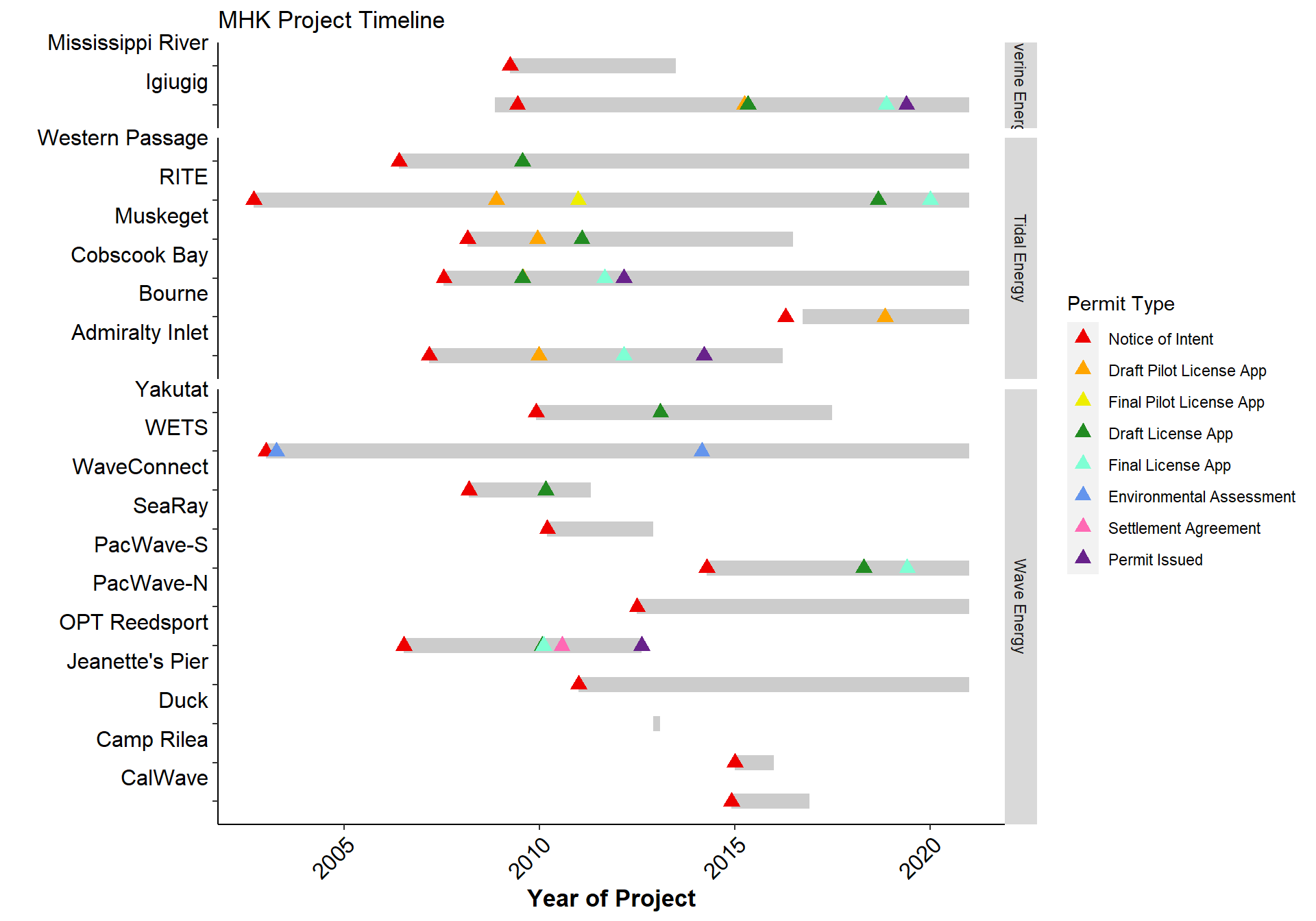
Static figure with sequential color palette
###ggplot figure that has points and bars indicating permitting
#the fig.width and fig.height above determine the figure size overall
#pick the color scale
scale <- brewer.pal(n=10, name = 'PiYG')
scale <- scale[c(1:4, 7:10)]
#the input to ggplot is what determines the tooltip label
g <- ggplot(d_permits_2,
aes(text = paste('License Date: ', license_date, '\nProject Name: ', project_name, '\nPermit Type: ', permit_type))) +
#the segment is a gray bar that covers the time period of the permits
geom_segment(data = d_times,
aes(x = date_beg, y = project_name, xend = date_end, yend = project_name), size = 4, color = "gray80") +
#the points have colors and shapes indicating different permit types
geom_point(data = d_permits_2,
aes(x = license_date, y = project_name, color = permit_type), size = 3, shape = 17) +
scale_color_manual(values = scale) +
#label the plot
labs(title = "MHK Project Timeline", x = "Year of Project", y = "") +
facet_grid(rows = vars(technology_type), scales='free_y', space = 'free') +
#choose a theme
theme(panel.grid.minor = element_blank(),
panel.grid.major = element_blank(),
panel.background = element_blank(),
axis.line = element_line(colour = "black"),
#legend.margin=margin(100,100,100,100),
#legend.box.margin=margin(20,20,20,20),
#legend.position = c(0.9, 0.84),
#legend.background = element_rect(fill = "transparent", colour = NA),
#axis.text.y = axis.groups(unique(d_times$technology_type)),
axis.text.x = element_text(color="black", size=12, angle=45, vjust=1, hjust = 1),
axis.text.y = element_text(color="black", size=12, vjust = -1),
axis.title.y=element_text(face="bold", size=13),
axis.title.x=element_text(face="bold", size=13),
#plot.margin = margin(.15, .2, 0, 0, "cm"),
plot.background = element_rect(fill = "transparent", colour = NA))
# static
g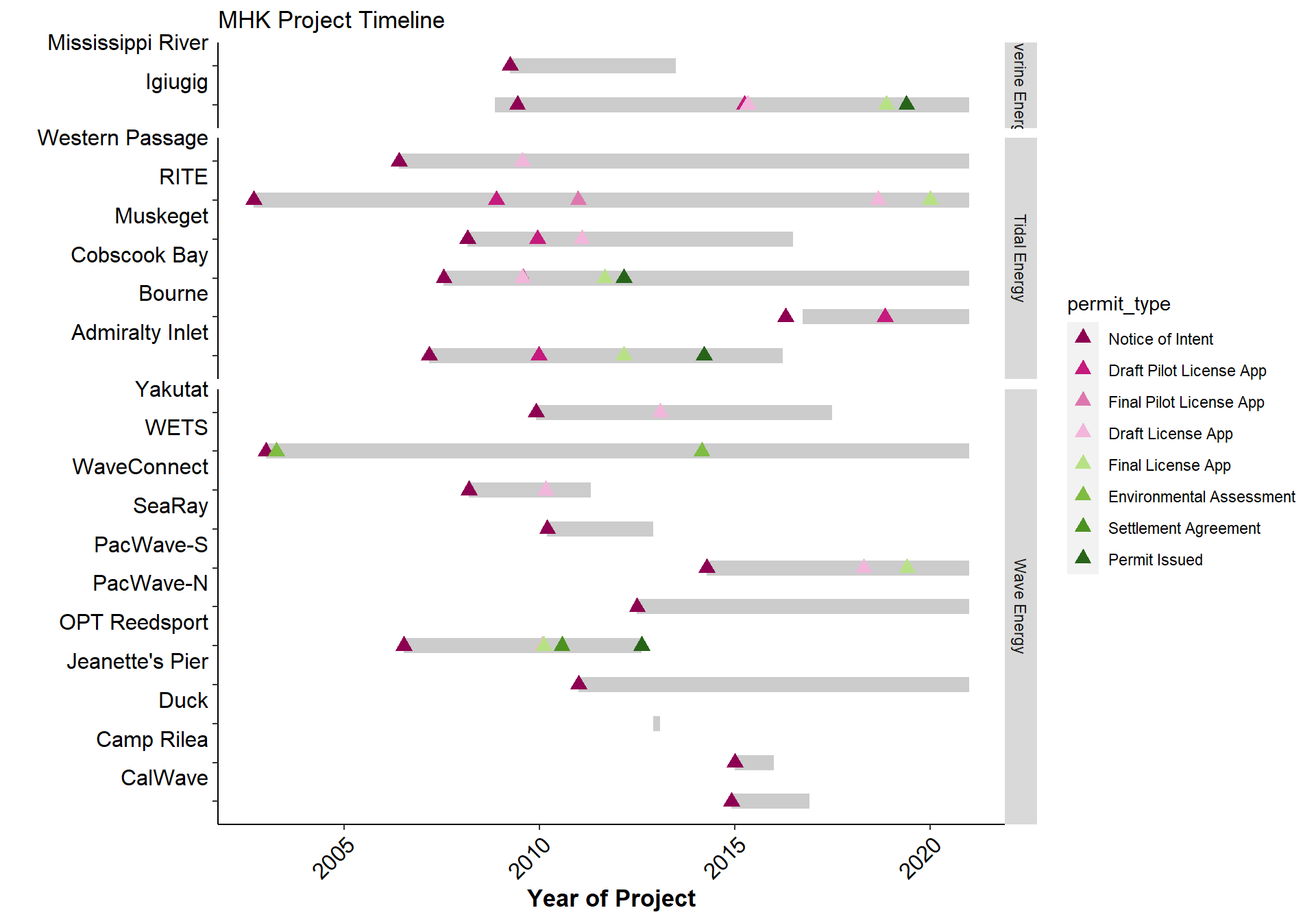
Interactive figure with tooltip
# interactive plot with tooltip
#specify the tooltip in the ggplotly function to get custom text
p = ggplotly(g, tooltip = 'text', height = 700, width = 1000)
#p

##this part is from stackoverflow and works to adjust the y axis ticks and labels, as well as partly adjust the gray bars on the right
len <- length(unique(d_times$technology_type))

total <- 1
for (i in 1:len) {
  total <- total + length(p[['x']][['layout']][[paste('yaxis', i, sep='')]][['ticktext']])
}

spacer <- 0.01 #space between the horizontal plots
total_length = total + len * spacer
end <- 1
start <- 1

# fix y-axis tick marks: yaxis, yaxis2, yaxis3
#for (i in c('', seq(1, len))) { # i = 1
for (i in seq(1, len)) { # i = 1
  yaxis <- ifelse(
    i == 1,
    "yaxis",
    paste0('yaxis', i))

  tick_l <- length(p[['x']][['layout']][[yaxis]][['ticktext']]) + 1

  #fix the y-axis
  p[['x']][['layout']][[yaxis]][['tickvals']] <- seq(1, tick_l)
  p[['x']][['layout']][[yaxis]][['ticktext']][[tick_l]] <- ''

  end <- start - spacer
  start <- start - (tick_l - 1) / total_length
  v <- c(start, end)
  #fix the size
  p[['x']][['layout']][[yaxis]]$domain <- v
}

#fix the first entry which has a different name than the rest
# p[['x']][['layout']][['annotations']][[3]][['y']] <- (p[['x']][['layout']][['yaxis']]$domain[2] + p[['x']][['layout']][['yaxis']]$domain[1]) /2
# p[['x']][['layout']][['shapes']][[2]][['y0']] <- p[['x']][['layout']][['yaxis']]$domain[1]
# p[['x']][['layout']][['shapes']][[2]][['y1']] <- p[['x']][['layout']][['yaxis']]$domain[2]

#fix the annotations
#for (i in 1:len + 1) {
  #fix the y position
#  p[['x']][['layout']][['annotations']][[i]][['y']] <- (p[['x']][['layout']][[paste('yaxis', i - 2, sep='')]]$domain[1] + #p[['x']][['layout']][[paste('yaxis', i - 2, sep='')]]$domain[2]) /2
  #trim the text
#  p[['x']][['layout']][['annotations']][[i]][['text']] <- substr(p[['x']][['layout']][['annotations']][[i]][['text']], 1, #length(p[['x']][['layout']][[paste('yaxis', i - 2, sep='')]][['ticktext']]) * 3 - 3)
#}

#fix the rectangle shapes in the background
for (i in seq(0,(len - 2) * 2, 2)) {
  p[['x']][['layout']][['shapes']][[i+4]][['y0']] <- p[['x']][['layout']][[paste('yaxis', i /2 + 2, sep='')]]$domain[1]
  p[['x']][['layout']][['shapes']][[i+4]][['y1']] <- p[['x']][['layout']][[paste('yaxis', i /2 + 2, sep='')]]$domain[2]
}

##this part I added and manually moves all the rest of the labels, the legend, bars, xaxis label, legend title
#change the legend location
p[['x']][['layout']][['legend']]$y <- 0.8
p[['x']][['layout']][['legend']]$x <- 1.1

#change the legend title location
# p[['x']][['layout']][['annotations']][[5]]$x <- 1.1
# p[['x']][['layout']][['annotations']][[5]]$y <- 0.82

#change the legend title
# p[['x']][['layout']][['annotations']][[5]]$text <- 'Permit Type'

#change the color of a shape to determine which one it is
p[['x']][['layout']][['shapes']][[4]]$fillcolor <- 'rgba(217, 217, 217, 1)'
p[['x']][['layout']][['shapes']][[6]]$fillcolor <- 'rgba(217, 217, 217, 1)'

#3 is top (riverine), 4 is middle (tidal), 5 is legend, 1 is x axis label, 2 is vertical label name, 6 is bottom (wave)
#those designations are for the boxes, the actual labels are screwed up and not attached to the right thing necessarily?
p[['x']][['layout']][['annotations']][[3]]$text <- 'Riverine'
p[['x']][['layout']][['annotations']][[4]]$text <- 'Wave'
p[['x']][['layout']][['annotations']][[2]]$text <- 'Tidal'

#moving vertical y labels to center them
p[['x']][['layout']][['annotations']][[3]]$y <- .94
p[['x']][['layout']][['annotations']][[4]]$y <- .28
p[['x']][['layout']][['annotations']][[2]]$y <- .72

#move the y axis label down
p[['x']][['layout']][['annotations']][[1]]$y <- -.1

#change the size of the bottom gray bar
p[['x']][['layout']][['shapes']][[6]]$y0 <- 0.01

###Note: cannot add annotations here - probably have to add them at the ggplot level and then can edit them here as needed
p
Interactive figure with clicking
d_projects <- d_permits %>%
  arrange(technology_type, permit_type, project_name) %>%
  nest_by(technology_type, permit_type) %>%
  nest_by(technology_type)

js <- HTML(paste(
  "
  d_projects = ", toJSON(d_projects, pretty=T), ";

  // technology_type facets
  yidx = {'y': 0, 'y2': 1, 'y3': 2};

  var myPlot = document.getElementById('PlotlyGraph');

  myPlot.on('plotly_click', function(data){

    // technology_type
    var yaxis = data.points[0].fullData.yaxis;
    // permit_type
    var legendgroup = data.points[0].data.legendgroup;
    // project
    var pointIndex = data.points[0].pointIndex;

    console.log(`yaxis: ${yaxis}`);
    console.log(`legendgroup: ${legendgroup}`);
    console.log(`pointIndex: ${pointIndex}`);

    if(typeof legendgroup !== 'undefined' | typeof pointIndex !== 'undefined'){

      d_tech     = d_projects[yidx[yaxis]].data;
      idx_permit = d_tech.findIndex(x => x.permit_type === legendgroup);
      d_permits  = d_tech[idx_permit].data;
      d_project = d_permits[pointIndex];
      link = d_permits[pointIndex].link;

      console.log(`project_name: ${d_project.project_name}`);
      console.log(`link: ${link}`);

      window.open(link,'_blank');
    }
  });", sep=''))

#tag the plot
p$elementId <- "PlotlyGraph"

#once the plot is rendered, use the js code to make it clickable
tagList(
  p,
  onStaticRenderComplete(js))